From the inside of my design world, I can't see what my style is.
It seems to change from week to week, depending on what I've fallen in love with.
Perhaps it's the approach I take to each design that defines my style.
But, whatever it is, this week I'm loving subtle colors and quiet vintage.
I'm still really digging the grunge/distressed look. It's been around for a long time now, and I see it everywhere, mostly on advertising fonts.
Working in vector, my favorite way to achieve a distressed effect begins in Photoshop. I create a 12" x 12" transparent 300 dpi document and use a wide variety of free web grunge brushes in black. Saved as a png, I open it in Illustrator, use Live Trace, then work it into a seamless tile.
It is now a vector grunge repeat that I can lay over an existing design.
Here's a recent example:
I love it!
I LOVE this floral!
I basically redrew an image of a 19th century fabric, simplified it, and added a textured background.
A bright, more contemporary color palette was also in order.
It really is stunning, if I do say so myself.
It's available to purchase in perfect repeat.
I found myself away from my own designs during the last 10 days. Fun personal stuff and working designing for someone else at a paying job took priority. I'll be seeing my designs on scrapbook paper in the near future.
I had another card approved at Greeting Card Universe. I like to think this is an honor since the process can take 10 weeks . And many, many long-timers at GCU are retroactively having cards deleted as they no longer live up to the higher and higher standards.
This artwork is different for me since I used Photoshop for to distress and layer the textures.
Illustrator is my home. I only visit Photoshop on occasion.
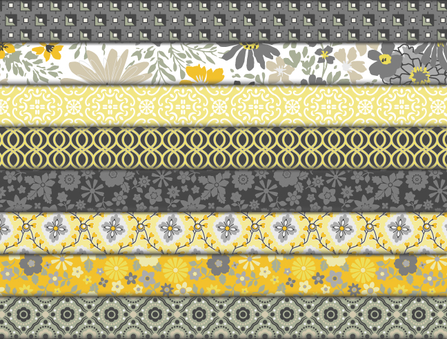
After being waylaid with other design work, I have finished my next quilt fabric collection. It includes 6 patterns. The focal fabric, that big flower with the fancy stripe is awesome! It was inspired by an antique French textile.
This is the the "working" color palette, but that yellow/green is not quite right, a little off-putting. I'll be going in now and exploring alternatives.
The collection I have planned next will be much simpler, perhaps just three colors.
After I initially posted the image above, I revamped the colors. These are happier, friendlier.
I've completed the third and final colorway for this group.
Tomorrow, I'll begin work designing a new quilt fabric collection!
After recoloring my recent quilt fabric collection, I applied it to a different digital quilt block than yesterday's.
It makes me happy!